SERVICES
BRANDING / PACKAGING
Description
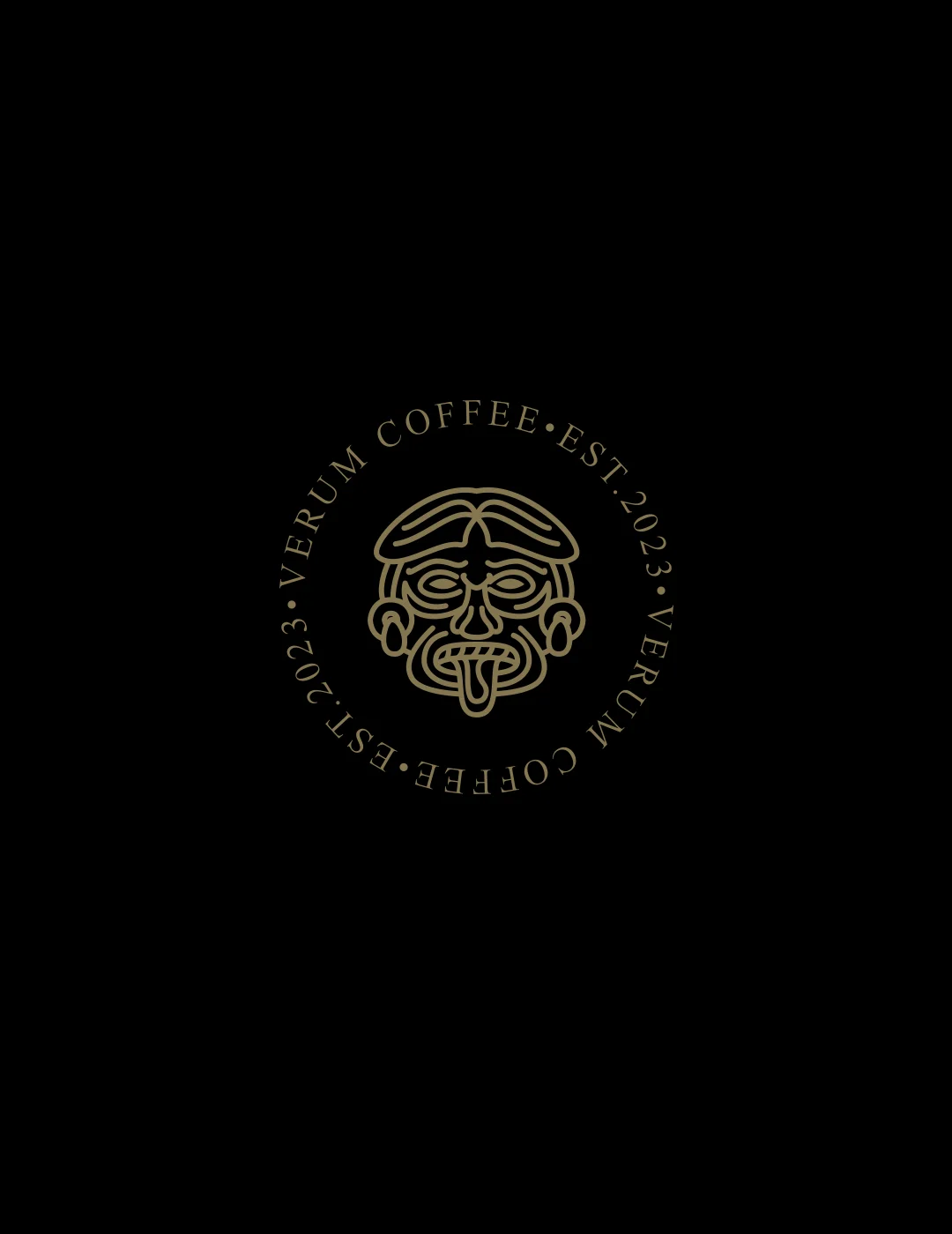
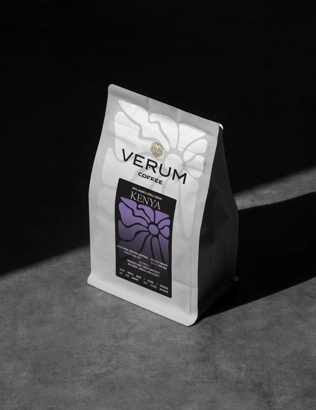
The logo and the complete visual identity system for Verum Coffee were designed to reflect the character of a coffee brand that seeks to bridge respect for origin with the everyday ritual of coffee.
We drew inspiration from the historicity of Andean and Central American civilizations, adopting morphological elements that reference symbolism, masks, and patterns of ceremonial significance. The result is an emblem that functions both as a seal of authenticity and a symbol of collective identity.
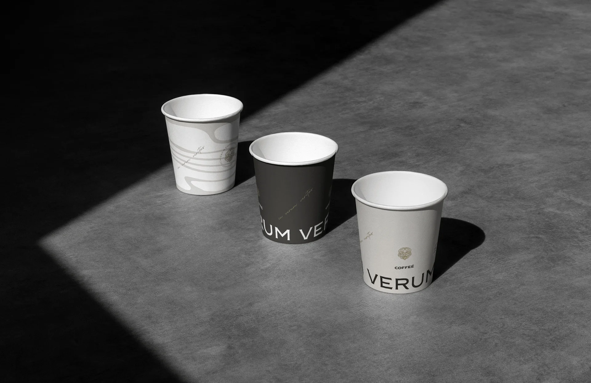
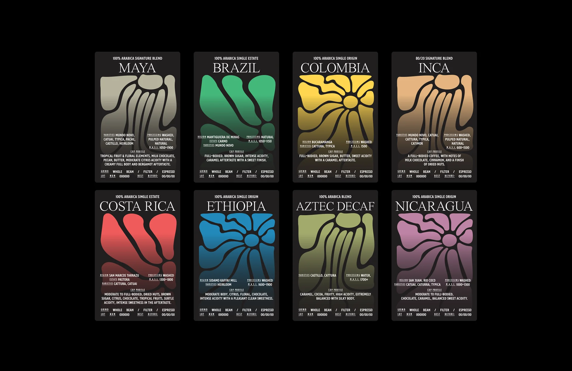
The verbal title Verum (Latin for “true”) is accompanied by a visual system composed of abstract shapes, carefully constructed to communicate variety, geography, and flavor profile. At the heart of the design lies clarity, consistency, and universality, free from unnecessary ornamentation.
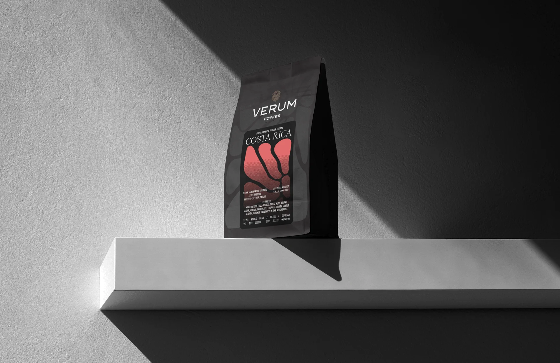
The set of ten labels, each with distinct color, form, and typographic layout, establishes a cohesive design system that enables intuitive product categorization. Simultaneously, the use of fluid, wavy illustrations allows for a more emotive connection to the content within each package.
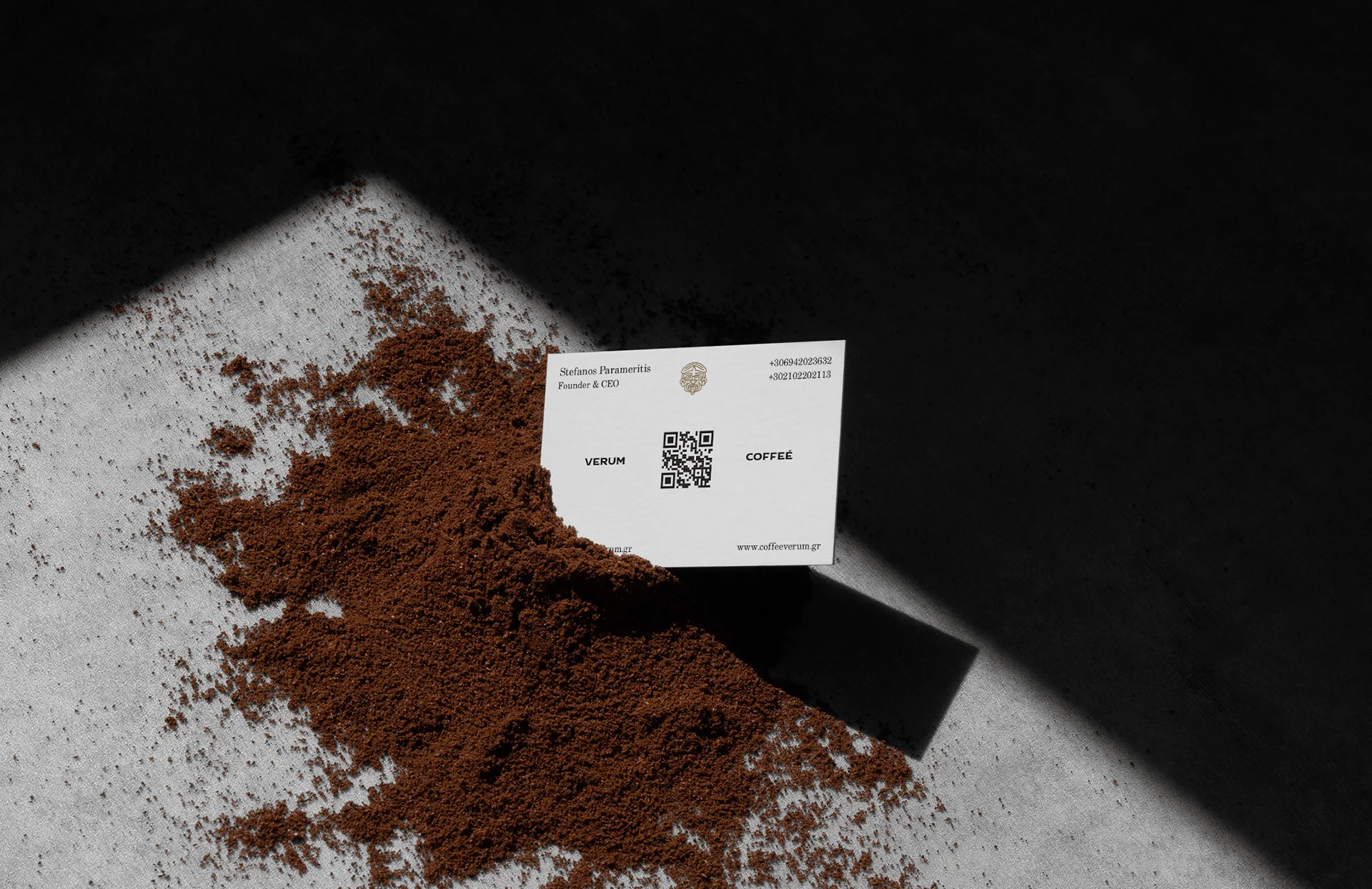
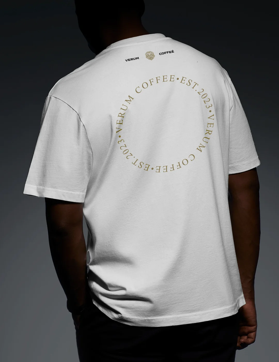
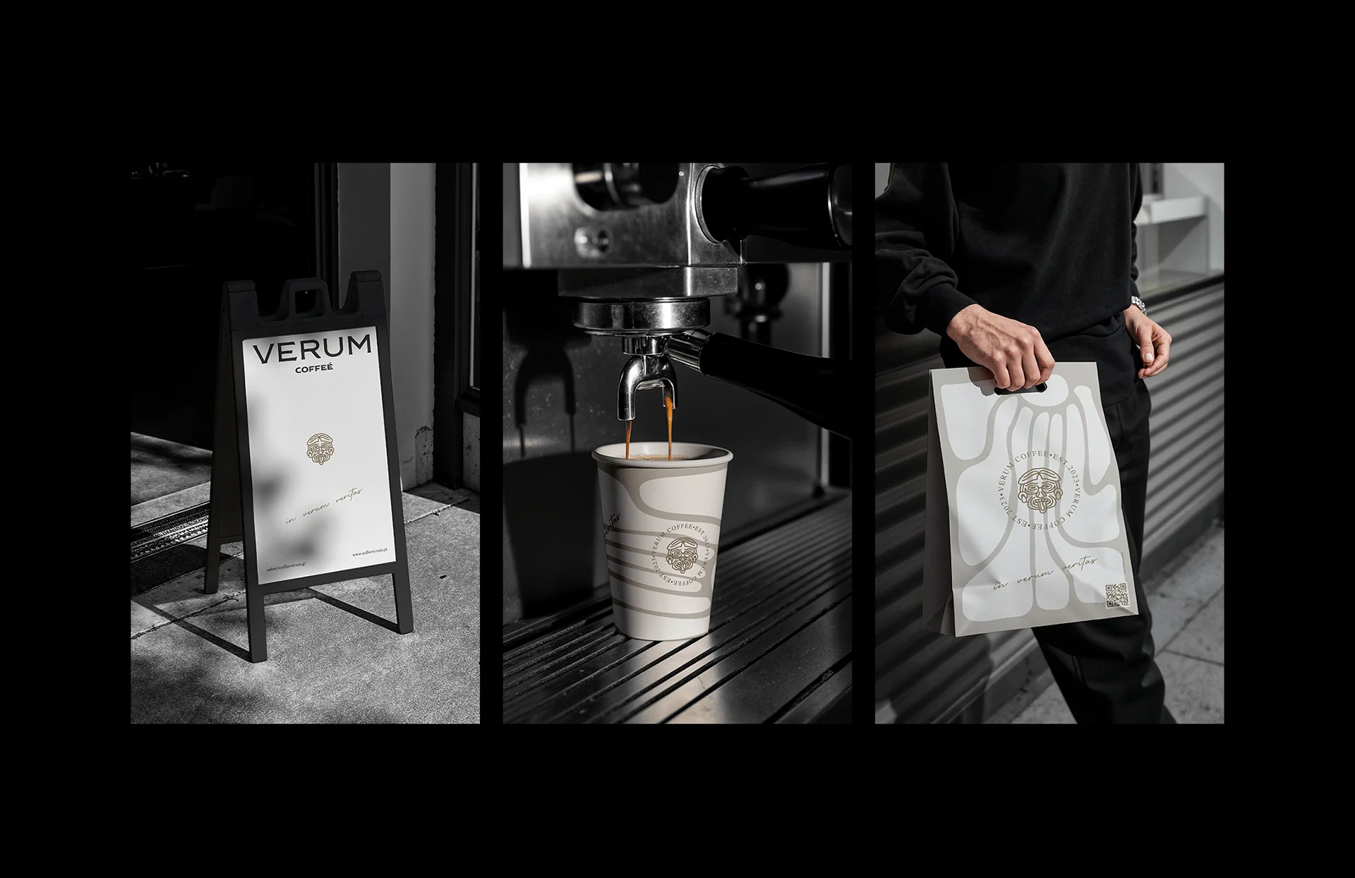
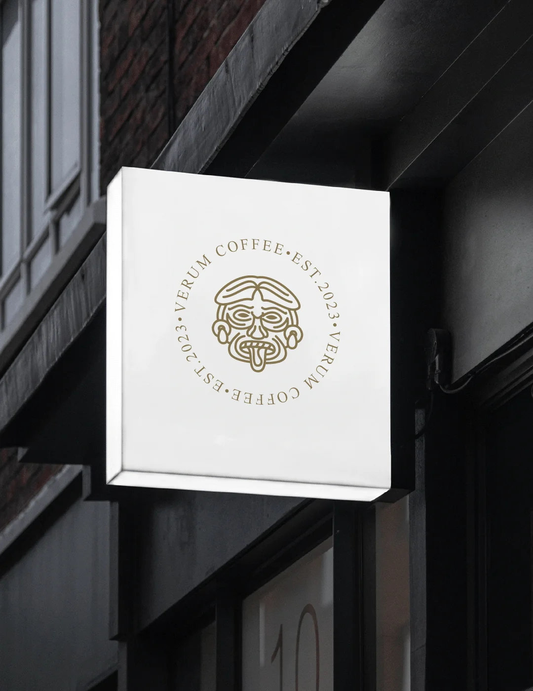
The visual language was applied across all materials: from retail packaging and merchandise to signage, takeaway cups & carriers, delivery boxes, and corporate print collateral.
Verum Coffee was designed not to appear premium but to be: authentic, refined, and grounded in its origins.