SERVICES
PACKAGING
DESCRIPTION
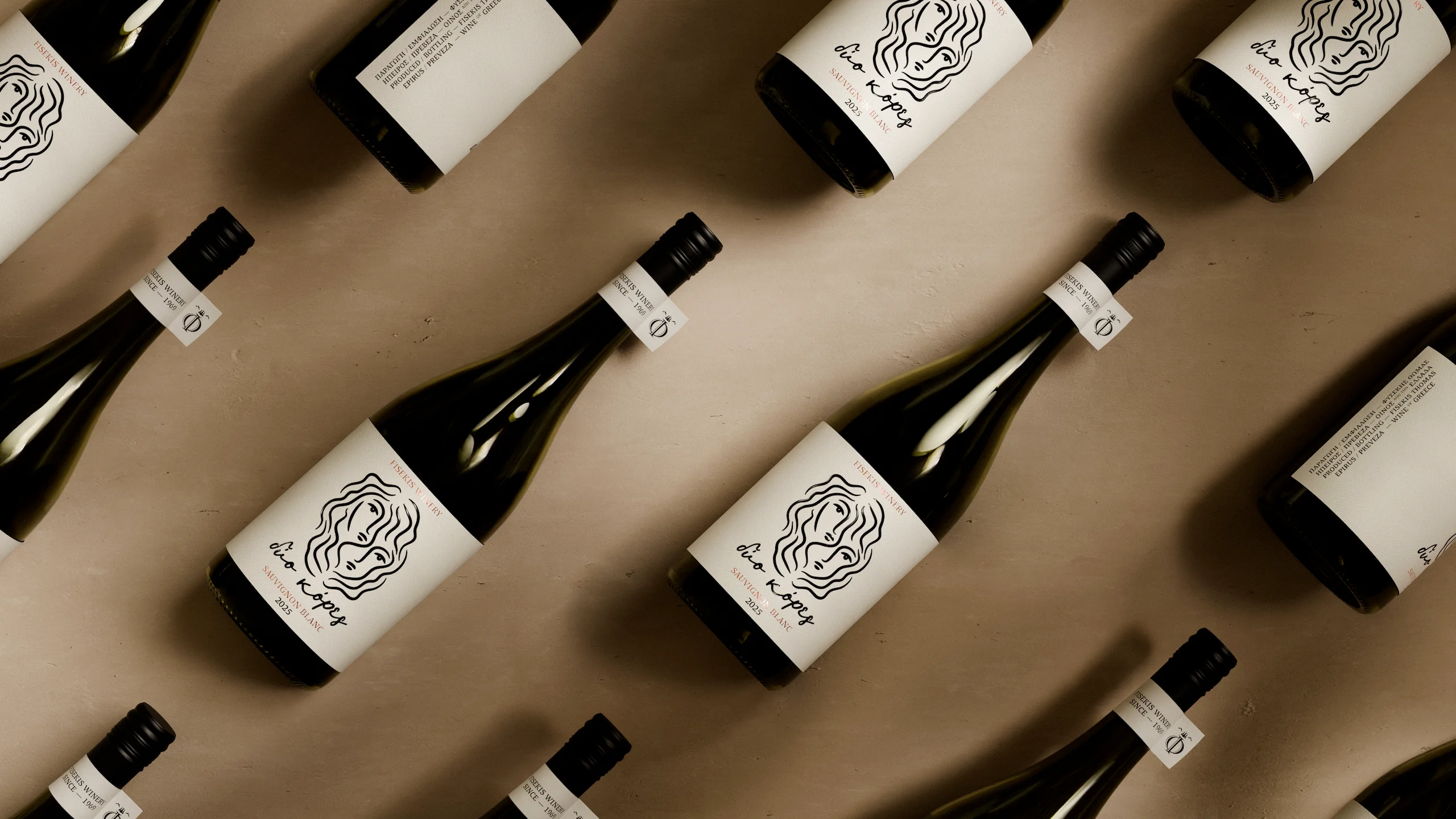
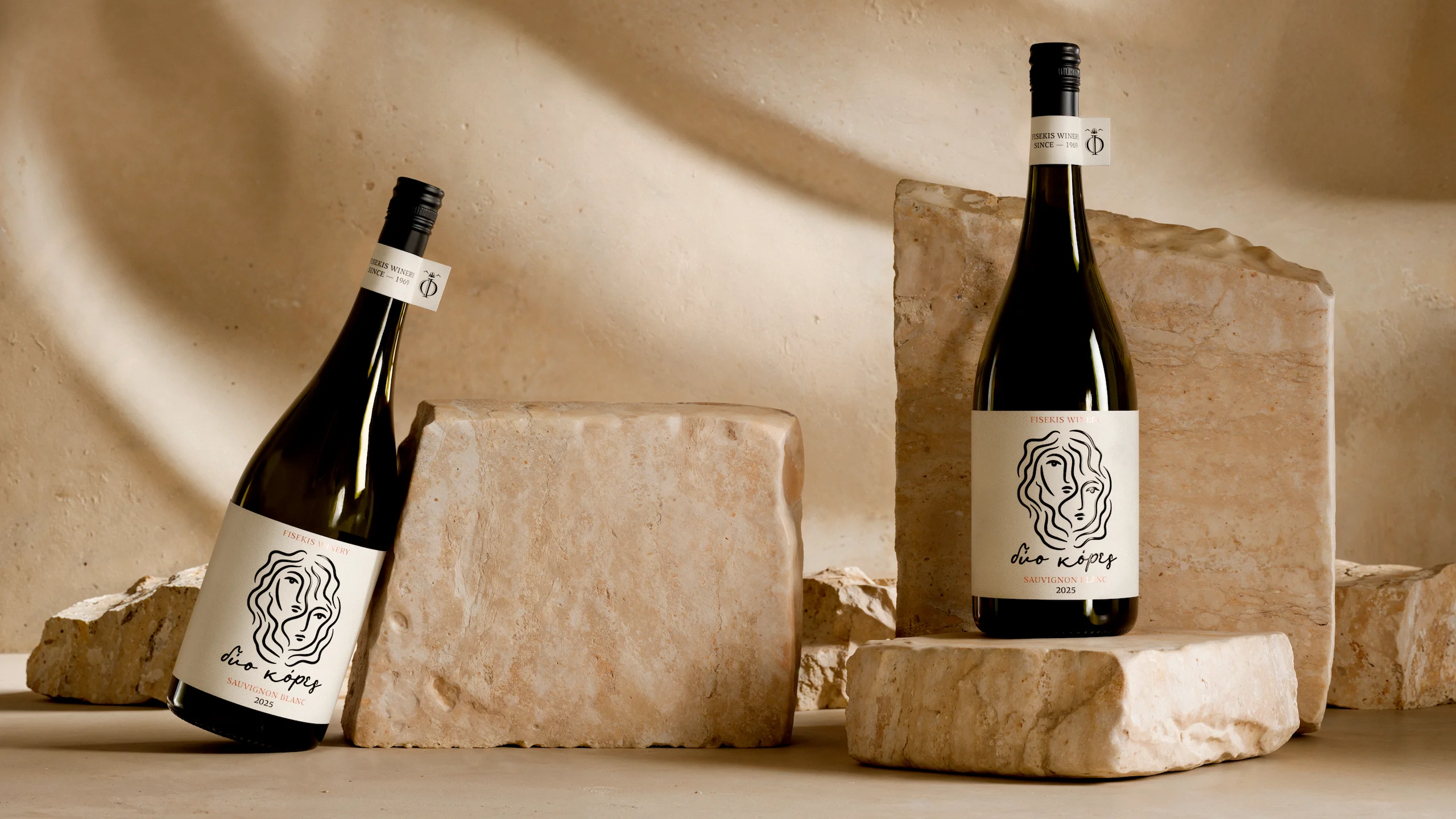
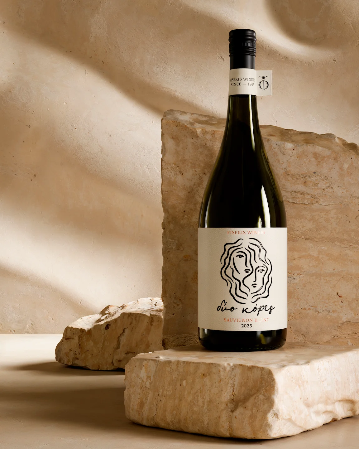
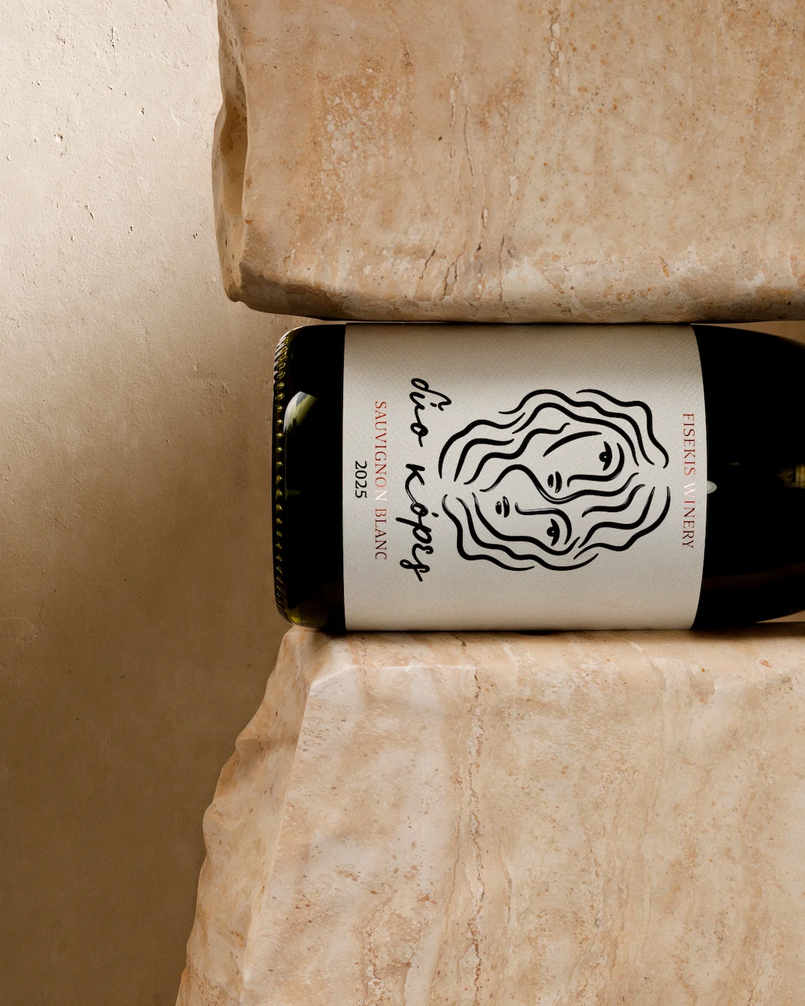
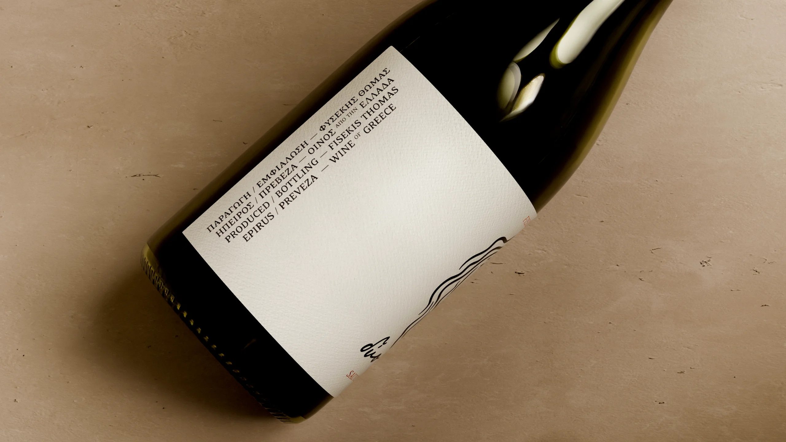
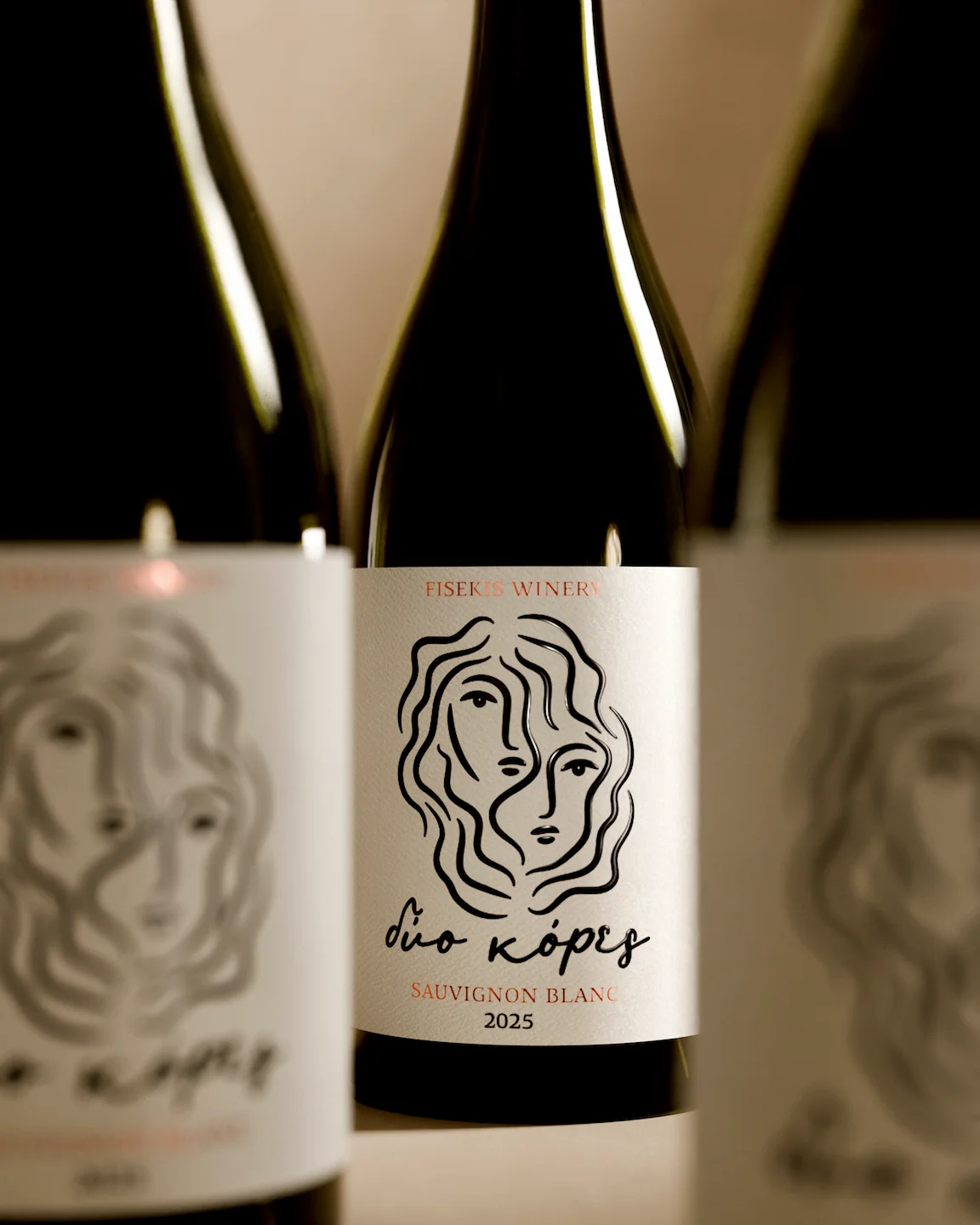
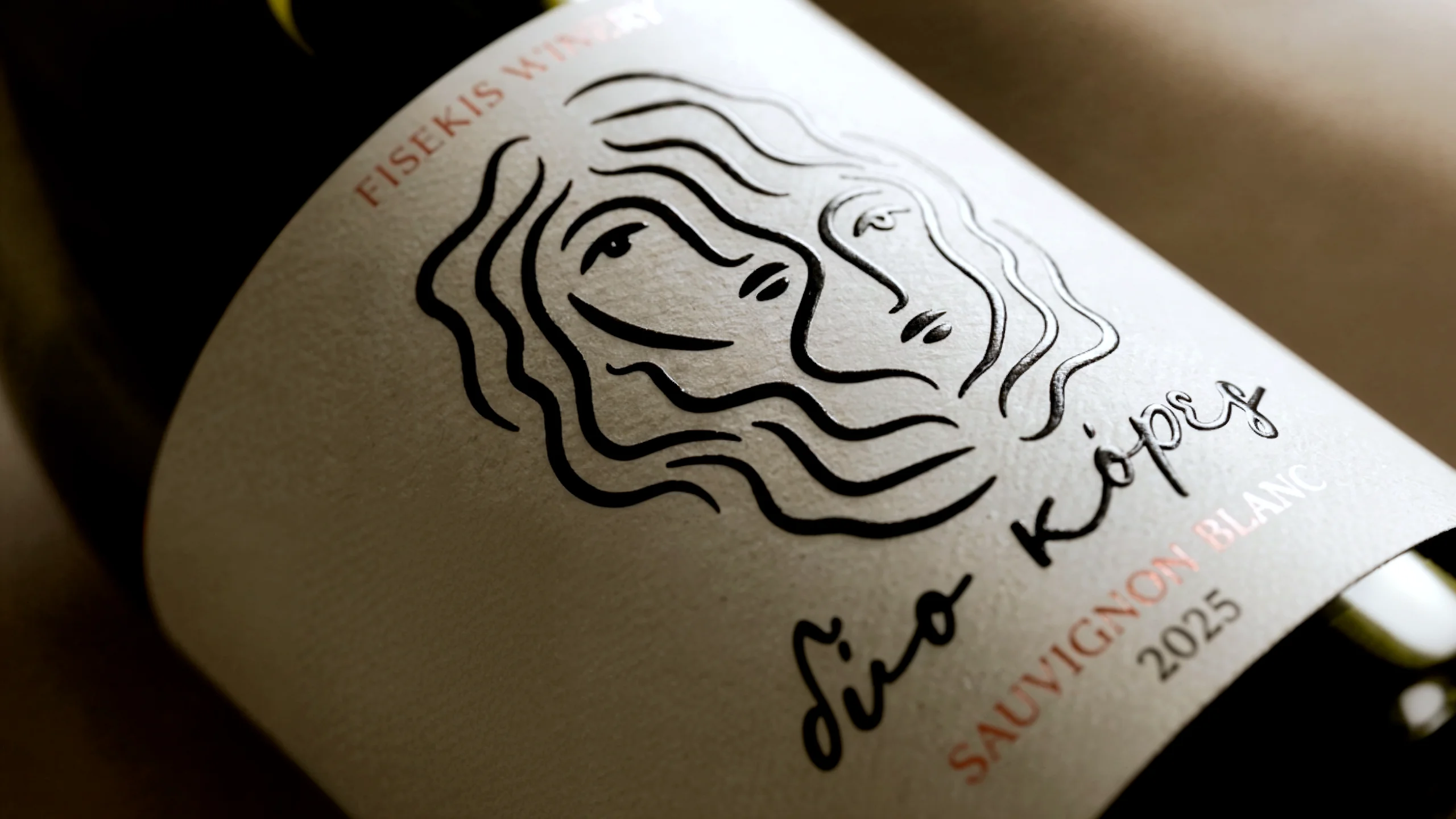
The packaging design for the Dio Kores (Δύο Κόρες) wine unfolds as a visual narrative of bond, where two faces share the same line without losing their individual identity. The figure at the heart of the label was born from the wine’s own name two heads, two gazes, merged within a single mesh of wavy lines.
The illustration holds an unbroken, handmade rhythm; no line repeats, and every curve carries the imperfection and vitality of a sketch, evoking a family narrative rather than a decorative motif. Dyo Kores logotype follows the same logic, hand-lettered in a slanted, unsteady script that reads as a signature rather than bottle typography.