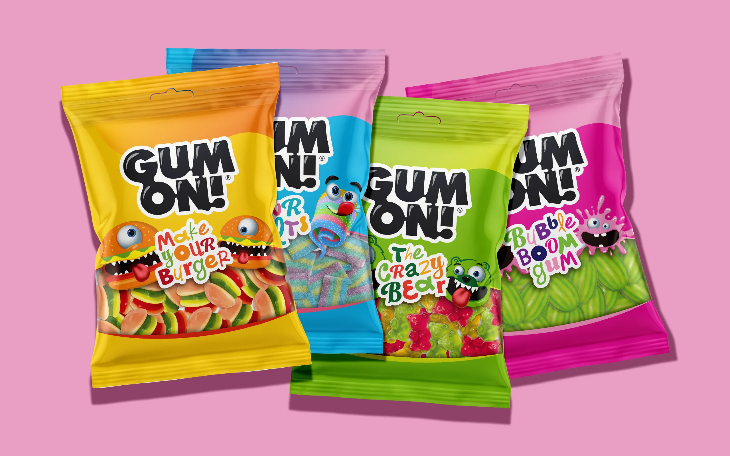
We developed a new layout architecture that organizes the content with a consistent hierarchy and allows each product to differentiate itself within a recognizable framework.
The logo takes on a more prominent role, while the characteristic lower “window” now functions as a key visual element that connects the entire series and highlights the product itself.
The characters and illustrations, an essential part of the GUM ON! personality, were redesigned with a more modern styling approach, cleaner lines, and unified proportions, forming a coherent creative universe.
At the same time, the color palette was reorganized to enhance the recognizability of each SKU, while maintaining a shared visual language across the range.
With this new approach, GUM ON! gains a refreshed and more dynamic identity, capable of supporting the brand’s portfolio and achieving strong shelf presence, all while preserving the cheerful and expressive character that made it beloved.
Client: Lavdas Α.Ε.
3D: George Andreakos, Lavdas S.A.