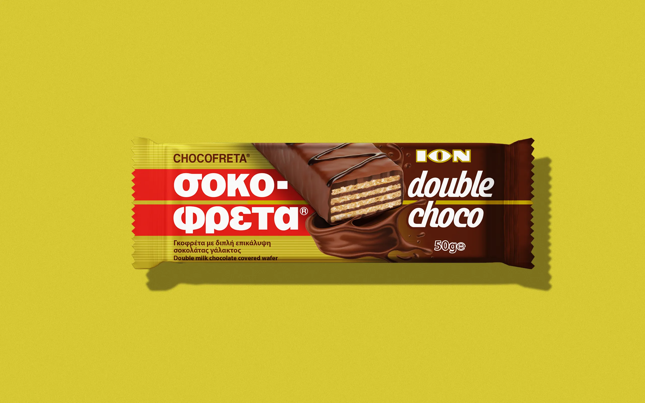
We developed an orchestrated flow between the familiar gold of Chocofreta and the deep, fluid chocolate that envelops the wafer.
The product illustration, featuring the chocolate flow, serves as a visual bridge—adding movement, texture, and a sense of richness that reflects the flavorful promise of Double Choco.
Typography
The typography was selected to converse with this dual world: it maintains the directness and stability of the classic form, while simultaneously incorporating a subtle provocation in its curves. Following the flow of the chocolate, it conveys the sense of density and smoothness that defines the new flavor, creating a vibrant rhythm that embraces the entire composition.
The result is a packaging design that converses with the brand’s heritage, yet dares to present a more contemporary and expressive character. A product that remains recognizable at first glance, but now reveals a new dimension of indulgence—meticulously designed with precision, materiality, and visual cohesion.